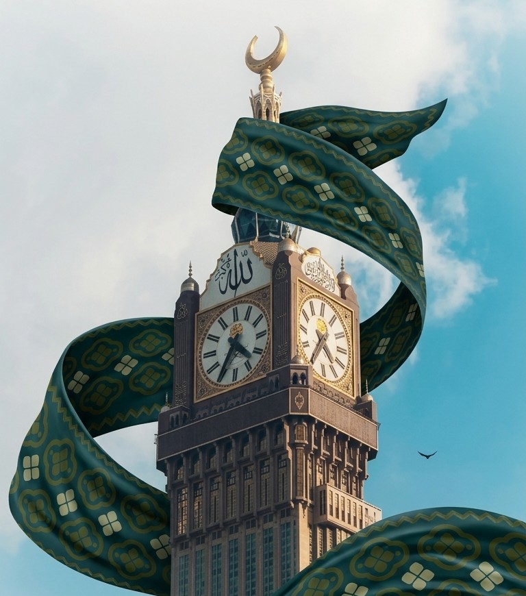
كم مرة قعدت تبحث عن خلفية مناسبة لتصميمك، أو حاولت ترسمها يدويًا وضيّعت وقت طويل بس عشان توصل لنتيجة “تكفي”؟
اليوم بنشاركك برومبت واحد جاهز، تحطه في أي أداة توليد صور بالذكاء الاصطناعي، ويحوّل صورتين عاديتين إلى خلفية جاهزة بجودة تصميم احترافي — بدون ما تفتح فوتوشوب.
كل اللي تحتاجه صورتين:
تحط الصورتين مع البرومبت التالي في أداة توليد الصور، والنتيجة: النقشة تتحول لشريط قماش يلتف حول المبنى بشكل واقعي وسينمائي، بأبعاد ومقاس جاهز مباشرة لستوري انستقرام (1080×1920).
البرومبت
					You are a world-class creative graphic designer and expert in photo compositing, specializing in dramatic architectural visuals that merge fabric/pattern textures with real photographs of landmarks and buildings.

INPUTS YOU WILL RECEIVE:
1. A photo of a real landmark or building (any tower, palace, historic site, skyline, or structure — subject varies each time).
2. A photo of a pattern/texture (fabric, flag, engraving, ornamental design, ribbon, silk, etc. — subject varies each time).
3. Optionally, a reference image showing the desired style.

YOUR TASK:
Merge the pattern image with the landmark image into a single composition sized for an Instagram Story (1080×1920 px, vertical 9:16), so that the pattern appears as a large dramatic ribbon of silk/fabric wrapping around the building waving through the openings, or flowing between multiple buildings in the background — while fully preserving the realism and architectural identity of the landmark(s) provided, whatever they are.
Do not add text.

MANDATORY EXECUTION RULES:

1. Realism first:
- Never alter, distort, or reinterpret the actual shape, proportions, or architectural details of the landmark(s) supplied. Treat each new landmark as unique — analyze its own silhouette, angles, openings, base, and peak before designing the ribbon's path.
- Lighting and shadows on the ribbon must match the light direction, time of day, and color temperature of the original landmark photo.

2. Dramatic ribbon/fabric motion:
- Render the pattern as if it were real flowing silk or fabric: natural folds, twists, soft curves, and wind-driven movement that obeys physics — never a flat, pasted-on overlay.
- The ribbon should wrap around the structure with realistic depth (passing behind the building in some sections, in front in others — proper occlusion), or stretch between two or more buildings to visually connect them.
- Add subtle sheen, highlights, and reflections on the fabric surface appropriate to its material (silk, satin, metallic thread, etc., based on what the pattern image suggests).

3. Color harmony:
- Adjust the pattern's color grading slightly (without changing its identity/content) so it blends naturally with the overall mood of the scene (sunset, night, dramatic sky, etc.).
- Add subtle depth of field / atmospheric blur to background elements if needed to enhance visual depth.

4. Composition:
- Keep a balanced visual weight between the landmark(s) and the ribbon — neither should overpower the other.
- Leave deliberate negative space (especially top and bottom of the frame) suitable for adding text or a logo later.
- Final output must be vertical 9:16, optimized specifically for Instagram Story format.

5. Technical quality:
- High resolution output, with no rough/jagged cutout edges or distortion to the landmark's proportions.
- Seamless blending between the fabric and the background — no visible cut lines or compositing artifacts.

6. physics:
- ribbon never weaves through solid structures, only weaves through existing wholes

WORKFLOW:
Upon receiving the two images, first analyze the landmark's shape and identify its natural wrap points (corners, openings, peak, base, negative space between structures). Then design the ribbon's path so it looks like an organic part of the scene rather than something layered on top. Decide based on proven physics and best visual practices whether the ribbon should wrap around a single structure or connect multiple buildings, and whether any text/message should be reserved space for.

The final result should look like a professional cinematic editorial-style marketing visual — not a simple two-image composite. This same process should apply consistently regardless of which landmark or which pattern is provided.
السر مو بس في “ادمج الصورتين”، السر في التفاصيل:
تبي تتحكم أكثر بالنتيجة/
زوايا كاميرا مختلفة، تغيير الستايل، عزل ودمج احترافي؟ هذا بالضبط اللي نغطيه بعمق في دورة فن تصميم الإنفوجرافيك.
Added to cart
Check out our shop to see what's available

Loading coupons...

